2020 Redesign
The concept I had in my head for my 2020 redesign was a website that:
- Is not traditional
- Only presents the visuals you need in order to engage with the site
I envisioned a clean interface on the surface that primarily achieves what I want from the visitor: the ability to learn about me through photography and video. Therefore the entire website becomes a gallery and the gallery becomes the design. I attempt to lure you into clicking the main photo so the photography takes over and nearly 20 years of history are communicated to you visually in a matter of minutes. If you continue to engage with the site, the content and the gallery should not visually clash or interfere. I also wanted to create a speedy navigation experience that has those elements right at your mouse or fingertips. Under the hood I wanted to make sure I optimize everything from desktop to small devices with an eye on data and resource management between the platforms.
Mobile Experience
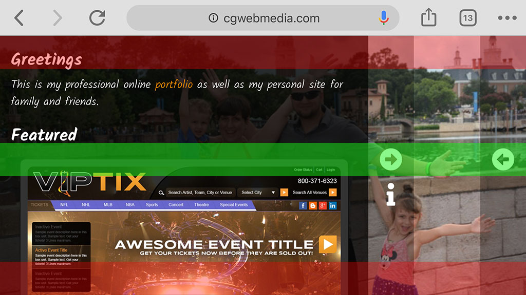
99% of the navigation I see on a mobile web interface places the navigation in the highlighted red zones. It's not a big deal if you rest the device on the palm of your one hand so that your other hand is free to touch anywhere, but if you cradle the device in both hands - as one would when typing a message/filling out a form/etc. - you need freakishly long thumbs to reach the typical navigation zones. So for my site I decided to place the navigational elements basically directly where my thumbs reside. With this layout/pattern I don't find myself having to switch my grip from page to page as I can manipulate the navigation as well as the content with just my thumbs - like a gamepad!
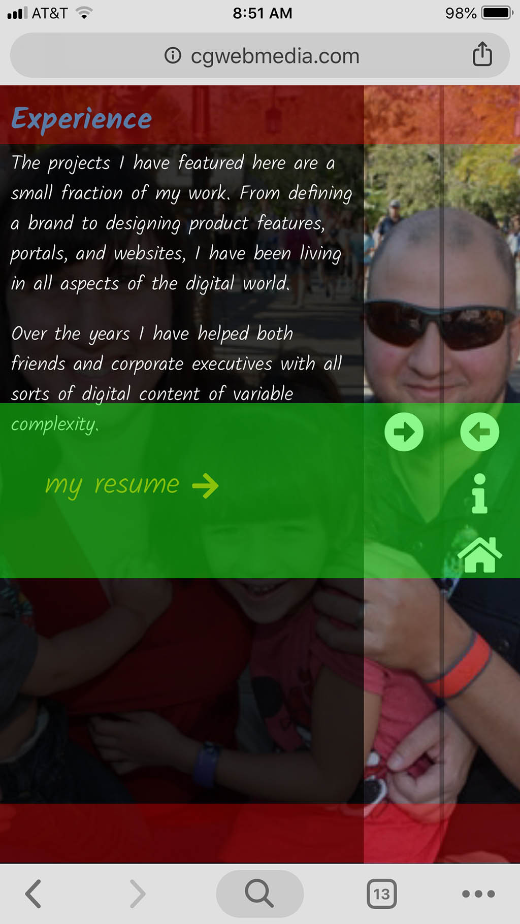
Navigation
I was really trying to avoid:
I set a goal to have noting "traditional" and that icon is a big offender. While I received some positive feedback from my tech-savvy friends, my own mother got lost. I mean the reality is she was mesmerized by the photos and overlooked the arrows/panels, but my UX to funnel the visitor to specific sections failed on her; at least initially. So she suggested I actually do show a complete list of pages at least somewhere, so I decided to accommodate her wishes - for the most part. I don't enable it everywhere and I am still trying to fine tune the UX.
Content Panels
Around 2014 I developed these "flyout" panels for the EarthLink enterprise portal. I quickly learned the pros and cons of having a bunch of interactive content inside a content block pinned to the left side and the right side of a fluid browser window. I still managed to create a fairly bulletproof interface that would slide in and out; able to withstand thousands of customers across many different browsers. The panels stood the test of time and were rebranded in 2018 for the Windstream enterprise portal, but for my 2020 redesign, I decided to revisit this UI pattern and wrote a new set of slide out drawers. These new panels are a lot faster/smoother, a lot more efficient, and a lot less prone to positioning errors. They also give me greater control over any responsive content inside them with very little amount of JavaScript overhead.
Audio
A good friend and colleague of mine looked at my site and joked: "auto play audio = close browser and never come back." He has a point and since there is some truth in every joke, I thought long and hard about this behavior. I don't advertise anything and most of the stigma surrounding audio on a website comes from obnoxious advertising. I designed the site to be viewed as you would a trailer or a movie, and if my trailer or my movie ever started playing without the audio, I would assume there is something wrong with my receiver; or computer audio in this case. But if you do need to pause or mute the presentation, I made sure to give you quick access to those controls.
To-Do List
- Wow Factor! Right now it's still missing. In 2009 I integrated transparent dynamic videos of myself seamlessly into my site. The amount of work that went into that was extraordinary. You can still check it out if you manually enable Flash - while you still can. But Flash is dead with no suitable alpha video container support in its place, so my gears are turning with what I can do next that could be fun and exciting. I've got some ideas brewing and it's going to be wild if I can pull it off :)
- Freature more projects and add descriptions.
- Add captions, credits, and other info for some of the clips and music featured in my video compositions.
- Finish writing my video player which is now the foundation in my UI. Back in the day I wrote my own AS3 video player so now I have to write a new one for the modern age of JS.